Week 12 – Reflection

Last week we presented our design proposal to the class, and I think we did quite well.

We were straight to the point in presenting our concept, instead of doing a big long introduction and talking about research, data and failed concepts first. We imagined that if we were the client, we would just be really excited to see the design mockups, and would then like to hear the reasoning behind them. We wouldn’t hear all the statistics and background research before having the designs finally revealed. I’m really happy that we cut to the chase and rationalised our designs as we went.

This project and unit was very beneficial to me, to be able to learn first-hand how much work and research it should take to come up with a good design solution. I now recognise the downfalls in the way I have approached design briefs in the past, and will now start to think about the things I have learned from this class.

A couple of the things I found most helpful are:

  • Convergent and Divergent thinking, and brainstorming enough ideas to be able to make a confident decision in a way forward
  • Reframing the problem, not just taking it for face value. The tutorial in which we discussed the wrist watch was most helpful in understanding the concept of going further than what you initially think the problem is.
  • Doing research- and not just existing design solutions, which can keep you thinking within the box. If you only look at what’s already been done, how can you think of something new? By researching other issues relating to the problem, such as the audience’s real needs, and the history of why things are currently the way they are, you are able to understand the issues better and it will also help you reformulate the problem.

Week 11

Our group has been busy researching, sketching and finalising our Kopi branding and visual identity. While researching Indonesian coffee, I came across this fun fact: Indonesians are known for making and drinking the most expensive coffee in the world- coffee that has been predigested by cats http://www.npr.org/blogs/thesalt/2012/09/20/161478954/heres-the-scoop-on-cat-poop-coffee.

When we first started the design process we began with researching Indonesia and coffee because we misinterpreted the brief. We thought Kopi was to have an Indonesian/Australian identity (focus being on Indonesia) to make it stand out and be different, Here is an example of one of the rough concepts we first came up with.

Untitled

When we looked at the brief a  bit more, we realised that the Indonesian focus would not really work with what we are trying to achieve. As well as being different, we are trying to achieve an identity that would be readily embraced by typical Australian coffee drinkers. An identity that is too culturally aligned with another country would seem a bit alien and probably make people a bit wary.

Therefore, how do we create branding and an identity that is different enough to stand out, yet familiar enough to be comfortable and welcoming?

“So there’s a paradox. Brands and products need to be different to interrupt the pattern and grab our attention. But then feel familiar, trustworthy, conventional to win our hearts. We might be intrigued by a new style of yoghurt, or chocolate. But it needs to feel like yoghurt of chocolate to enter our lives. It needs to subvert the category then feel very much a part of it. Or it needs to make up for not feeling like we expect it to feel by reassuring us with comfort cues from other things we’re familiar with.” http://www.stormbranddesign.co.uk/stormbranddesign/blog/?p=541#sthash.Im4qOZ03.dpuf

Pugh Matrix

While I can appreciate how the Pugh Matrix would work in certain situations, I don’t see how it would really help with project 3.

I find that this method is a little too methodical for how I like to work with a design brief such as this one. I found the Kopi brief easier to tackle by using research and exploring different possible options as I went along to reach a final solution. If it was a design problem where there were more clearer, larger decisions to be made, I can see the value in using the Pugh Matrix.


Week 10


I really liked week 9’s lecture which talked about branding.

Branding is NOT:

– a logo

-an identity

– a product.

Branding is the perceived emotional corporate image as a whole.(http://justcreative.com/2010/04/06/branding-identity-logo-design-explained/)

The way I think of branding is more like the relationship the customer has with a company/business/service/product. It is the combined effect of more subtle things such as the language used in promotional materials. It is the “personality” or “character” behind the company, if you were to imagine the company as a person what would the person be like- trustworthy, caring, edgy, safe, daring, young, old? Branding is also the communication channels chosen- social media would be a relatively new way of promoting a company, and could make a brand seem more current and also more open to communicating directly with customers due to the very nature of the medium.

From the lecture notes:

“Trust comes from meeting and beating
customer expectations
Trust = Reliability + Delight”

In relation to the coffee shop project, it will be important to think about branding not only in terms of the logo and the visual identity, but focus on the “feeling” of the shop. A question I put to my group in our tutorial discussion was:

What is going to make people choose our coffee shop over other coffee shops in the first instance? And what is going to make people keep coming back?

I don’t think that cheap prices and quality coffee (as stated in the brief) is enough. Coffee drinking is a culture in Australia and we need to tap into what makes other coffee shops popular despite them having high prices. There is obviously something that makes people go to certain coffee shops again and again and pay premium prices- and I believe it is all about the branding and developing trust over numerous visits. It is the way the staff interact with the customers, it is the way the interior makes people feel when they walk in -is it a  comforting homely feel, or cool espresso bar ‘gotta-be-seen-here” vibe?

Trust is earned by providing fast reliable service (DO NOT forget a coffee order or make people wait too long!) and of course the coffee itself being a product that the customer is satisfied with. A positive experience like this will make the customer want to return to the shop the next time they want a coffee, because they know they can get it fast, and it will be good. Each time the customer returns and experiences this, trust is built and fortified.

Therefore, I think branding and trust is incredibly important, and needs to be thought about first and foremost before designing the logo and visual identity. The logo and visual identity needs to align itself with the branding to form a cohesive brand image.

When researching the Australian coffee market, I learnt that most of the market is made up of independent coffee shops, not chains, and that Australian customers are more inclined to go to their locally owned café rather than a Gloria Jeans or Starbucks. This trend is expected to continue:

“Consumers are expected to drive the trend towards smaller operators and niche providers, continuing to choose independent cafes and coffee shops over chain stores. Franchised operations will struggle as consumers generally associate better quality, ambience and experience with smaller independent cafes,” IBISWorld http://www.marketingmag.com.au/news/can-a-local-operator-succeed-where-starbucks-failed-in-australia-by-opening-more-stores-54136/#.VFrtqXKKCUk

When discussing this in our groups, we decided that our Kopi shop would have a boutique, homely, “hipster” brand where not everything is perfect to create a feeling of “handmade” and therefore, personal experience. The feeling would be quite opposite to other existing coffee shop chains that have strong identity systems which can come across as quite homogenous and uncaring. Kopi’s branding should take on more of an independent coffee shop feel, but still have a strong enough  identity system that means when people see a Kopi anywhere in the world, they will know what to expect.

We decided that we want Kopi to have some elements that are consistent across its stores, such as the logos, the takeway cup designs, loyalty cards and other elements such as patterns used for wallpapered interior, but everything else could look more like an independent coffee shop. This could be achieved by making use of second hand or locally sourced materials and furniture, handwritten menu signs and the like.

Project Scoping Document

Defining the problem and deliverables

1. Project Purpose Statement:       

To create a strong and unique brand identity for a chain of coffee shops “Kopi”.

2. Background:

Start up company Kopi (meaning coffee in Indonesian) is envisaged to be a new chain of coffee shops that are no frills without sacrificing flavour. This new coffee chain is a brainchild of young Australian entrepreneur with her maternal roots in Indonesia.

Kopi plans to serve mostly espresso-based beverages such as cappuccinos, lattes, etc. as well as teas and hot chocolates. They plan to stock long shelf-life products such as cookies and brownies.

The identity should reflect the brand’s position that good quality, ethically sourced coffee does not need to cost more. The identity should have an Australasian fusion narrative.

Customers currently pay up to $4.00 for a standard coffee from existing coffee shops. Many people consume coffee as a daily necessity, and Kopi want to target this group in particular and attract them as loyal customers with their low prices and high quality. Students in particular would be attracted to lower prices.

Although the coffee prices will be cheaper than other existing businesses, the identity should not LOOK cheap. Many people are quite particular about where they buy coffee from (and even take pride in their choice – coffee snobs) and by having budget-looking branding could potentially deter customers away before they try it. The branding should still look sophisticated to convey that low cost does not equal low quality.

3. Objectives:

  • Brand identity that can be used across a range of different products such as business cards, coffee cups, loyalty cards, signage, social media, look and feel of the shop itself.

 4. Key Stakeholders and Other Players:

This new coffee chain is a brainchild of young Australian entrepreneur with her maternal roots in Indonesia.

The target audience are students and professionals.

5. Organisational Requirements

Describe the client’s organisational, end user and customer requirements for this project.

6. Approach

Stage 1: Research

Stage 2: Concept development

Stage 3: Product design

Stage 4: Refinement

Stage 5: Proposal

Stage 6: Pitch

7. Timeframe & Milestones

Stage 1: Research

  • Existing coffee shops and brands
  • Mood boards
  • Indonesian narrative
  • Completion Date: TBC

Stage 2: Concept development

  • Idea generation
  • Brainstorming
  • SketchingCompletion Date: TBC

Stage 3: Product design

  • Logo design
  • Visual identity
  • Mock-ups of coffe cups, business cards etc
  • Completion Date: TBC

Stage 4: Refinement

  • Seek feedback
  • Make final changesCompletion Date: TBC

Stage 5: Proposal

  • Rationale
  • Report
  • Create presentation (Powerpoint?)
  • Handouts from presentation (should be a summary of presentation)
  • Project delivery: midnight Sunday, 26 October, Week 11
Week 7 Tutorial: Creative Process

Convergent/Divergent thinking

The tutorial exercises this week were eye opening because they showed how creative ideas can really flow when you are thinking rapidly and writing down anything that comes to mind, not just stopping at the first idea (the drawing exercise) and thinking about things in a not-obvious way. I realised that usually when I am trying to come up with a creative solution, I keep things in my head rather than writing them down. I also stop thinking when I think I’ve found the solution, and try to go ahead and implement it. Most times, I end up going back to the drawing board, because half way through the design I realised it wasn’t going to as well as I had imagined.

I now see the value of “brain dumping” or trying to explore all possible solutions before investing time in an idea. Doing so would also help “sell” your idea to the client, because you would be able to explain why your design is better than all other solutions, and give reasons why you had rejected the others.

“If all you have is a hammer, everything looks like a nail”

I really like this quote and I can relate to this in my own creative process and the culture of my work environment. We get stuck in the habit of relying on the same set of skills, and the same tools, and therefore tend to approach every creative problem the same way. There are several designers where I work, but the same type of work gets handed to the same people over and over again. Our supervisors think that if they give similar work to designers they know have done that work before, it would be efficient. But what has happened is that people are only developing a finite set of skills, and the work that is produced ends up looking the same. If design jobs were handed around to different people with different skills and perspectives, the team would be producing much more innovative work.

Week 4- Watch

In this week’s tutorials we discussed our homework question: “If you are asked to redesign a “watch”- how will you approach it?”

When I first saw this problem I did not know how to answer it. I couldn’t see a problem with the watch, and didn’t understand how you would reframe a problem that couldn’t be seen.

Any problems that I could see have already been tackled by new technologies.

After listening to Raghu though, I realised that I was thinking too much about how to improve an already existing design, instead of going way way back and thinking about why the watch was designed in the first place.

It was designed to measure and keep track of time. So when I thought about that, I started to ask questions such as:

“Why was time designed in seconds, minutes, hours… and could time itself actually be designed better?”

“Why do people use watches? To meet with other people, to keep schedules? Are there other ways that this problem could be addressed?”

Week 3 Tutorial – Paper Bridge, Design process

This week in tutorials we explored the concept of the design process. What we discovered was that the design process is rarely linear, it does not follow a neat flow of beginning, middle, end.

While we were completing the task of designing the paper bridge, we noticed that we went through a lot of trial and error.

First we identified all the mini problems inside the big problem. For example, the size of the paper did not reach. There was nothing tether the paper bridge to each table, and nothing to weigh the ends down.

Due to time constraints, we started implementing our first idea, without brainstorming other possible solutions. When the first idea did not completely worked, we looks at the merits of that design and thought about how we could improve it to over come the downfalls. Once we explored all possibilities with this first design, and none of them worked,  we had to go back to the drawing board and rethink a completely new idea. We did this a few times before we came to a solution that almost worked, but then unfortunately time was up and we did not succeed in the design task.

The paper bridge design problem helped to reshape our thinking when it came to the homework question.

My answer had been that it was a design problem. The questions I asked were:

– What are the different kinds and what are the typical traits of people with dimensia?

– Should you take a “one-size-fits-all” approach to the design, or a multi-faceted one, that could exist in different forms to cater to people experiencing different cognitive difficulties?

– Could it utilise non-traditional wayfinding methods and include interactivity?


Week 2 Tutorial – “Design Thinking”

In Week 2 tutorials, we discussed “design thinking” and how this process can be used or identified in other activities seen to be unrelated to “design”.

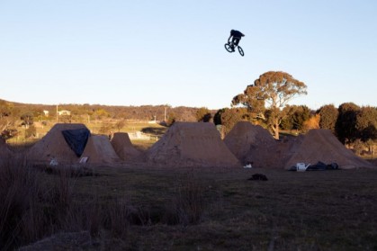
Some of my friends build dirt jump courses for bmx riders. The process can be seen as “design thinking” because they start with a blank canvas (the ground) and  have an end goal in mind, much like say, a graphic design job.


They have certain constraints that they need to work with, such as budget (they can’t always afford to hire a bobcat). They need to work with the existing dirt, which may not always an ideal texture which can affect the strength and sturdiness of the jumps. This can be related to any design job that involves pre-existing material, or if we are talking graphic design, where there is pre-existing branding that may not be working well for the project, or when the ideal paper stock is unavailable and you’re forced to make other design decisions to compensate.


This type of constraint forces them to think of ways around problems which is all part of the design thinking process. And of course they need to carefully design the course so that there is enough momentum to make it through the course start to finish, they need to be thinking about the distance between jumps, the height and steepness. Much like a traditional design job, they accomplish the best solutions through some trial and error, and user testing.

wamboin_lawndart-680x453